Kern
by Derek Beaulieu
Les Figues Press, 2014
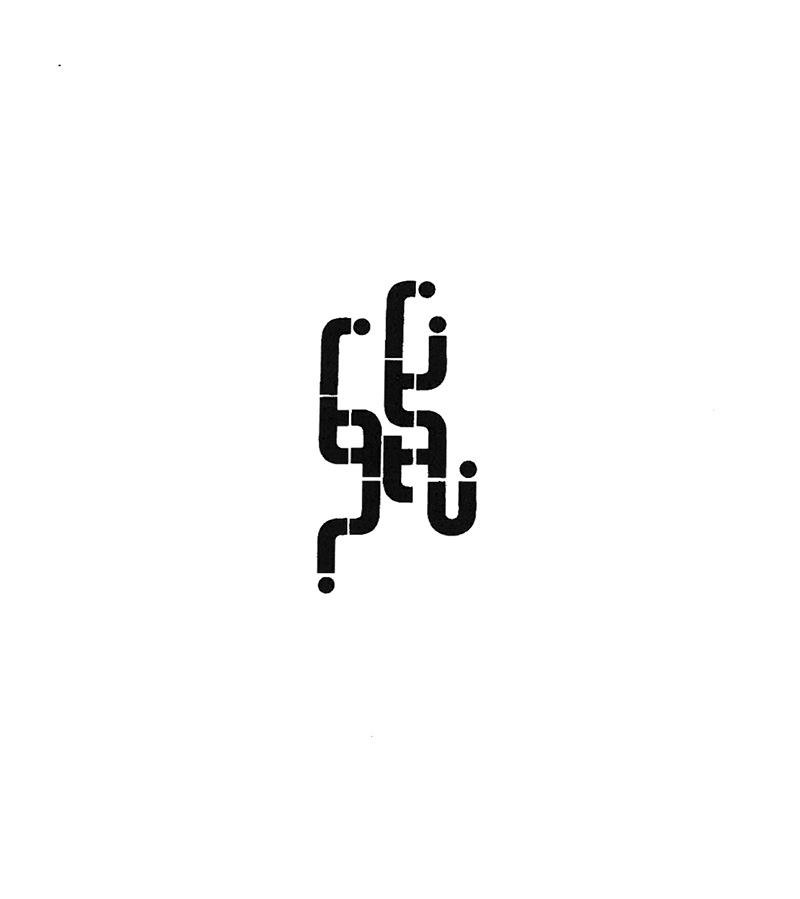
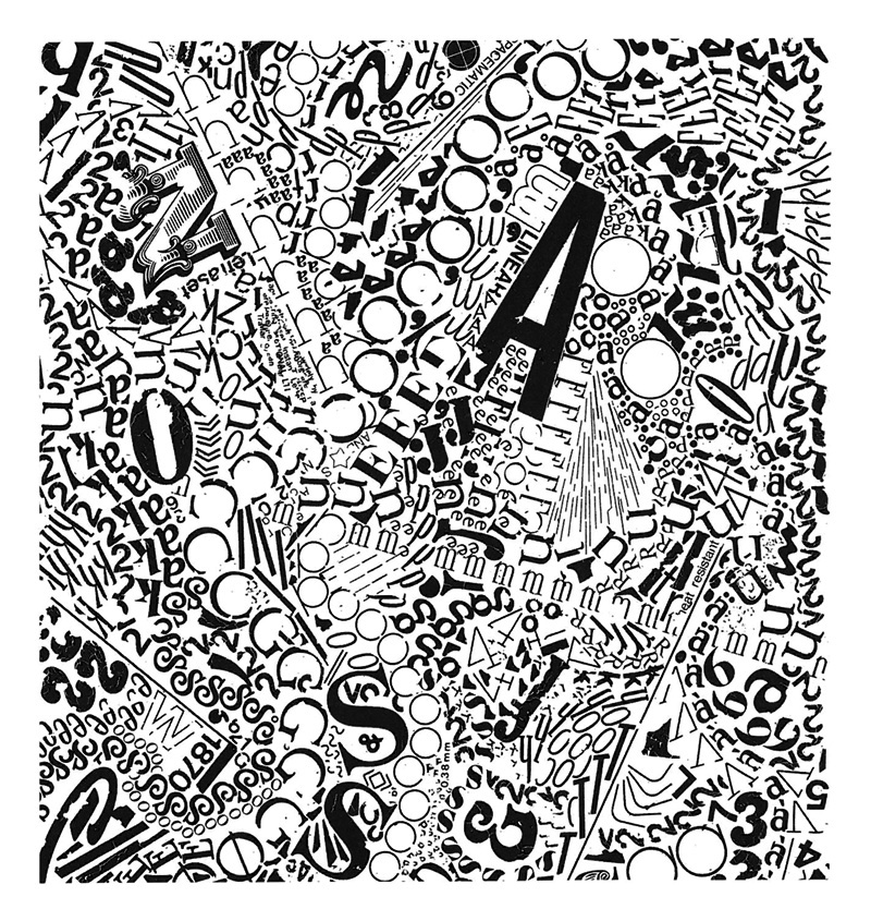
I must admit: the first time I flipped through Kern and looked at the various swirling typographic entities, two thoughts jumped into my head; how similar the pages looked to work by Australian book artist Lyn Ashby, and the other was jealousy at how much vintage dry-transfer lettering (Letraset) Canadian poet Beaulieu obviously has access to. It’s hard to come by here in Australia, and what we can still get comes only in very restrained font styles.
Both of my thoughts are valid, since the author’s note to Kern positions this ongoing body of work as being typical of Lettrism (without actually naming the field), a graphic practice that emphasises the ‘glyphic nature of the visual sign’ and ‘proliferates meaning through its visual properties’ 1: ‘viewers need not read, they only need momentarily stare and receive’ 2. I received comparative thoughts and emotional flare. Other viewers, of course, will have differing receptions. I say ‘viewers’ because these are letterforms that dissuade reading. This is confusing: such visual typographic play is common amongst graphic designers, but this is poetry. Isn’t it meant to be read?

from Kern, p 17
The overlap between experimental poetry publishing and artist books is fascinating, and still quite un-probed. If Kern were an artist’s book, I could talk about the sequence of images, how its march from small entities floating in white through to the overwhelming and crackling obliteration of the page space is a pessimistic foreshadowing of apocalypse. As a poetry volume, I can still say that – it’s hard not to think of societal breakdown when the object on the page is taking full advantage of its material origins by falling apart during the process of its very creation (cracking and failing to adhere, which is what Letraset does when it is rubbed too hard or not hard enough) – but there are ruptures in the sequence that undermine a clean visual reading. A book artist would allow the final images to move past the white borders of the page – bleeding out of the book – and would move back the vertical works on pages 82-85 so that they did not break the flow of disintegration. So, maybe not a straight line to dystopia.

from Kern, p 88